


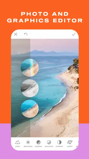
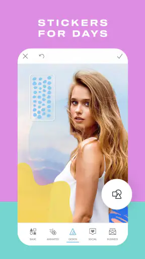
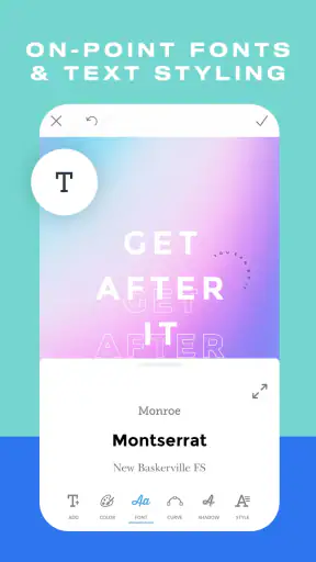
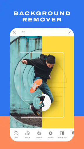
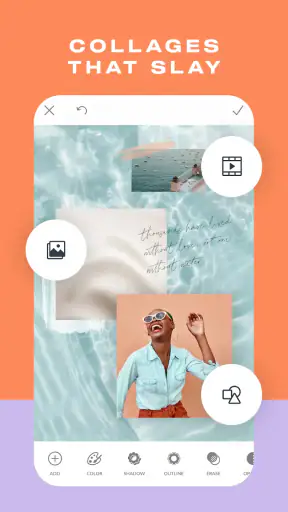
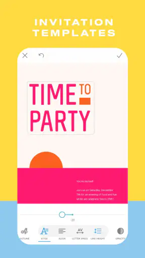

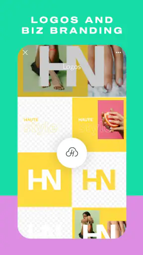
I approached PicMonkey Photo Editor as the sort of mobile photography app you open when a plain snapshot needs to become something presentable quickly. It is made by Shutterstock Inc. and sits in the photography category, but its appeal goes beyond basic filters. I found it more useful as a small design workspace for turning an image into a social post, card, collage, logo, sticker, or flyer than as a replacement for a dedicated professional camera editor.
The app is free to install and suitable for Everyone, which makes it approachable for casual users, families, students, and small businesses. Its current version is 1.20.12, and it runs on Android 8.0 or later. There are in-app purchases ranging from $0.99 to $120.00 per item, so the free starting point is convenient, but I would still check the cost of any effect, template, or export option before building an important project around it.
Where the editing experience usually gets stuck
My first impression was that PicMonkey is easiest to understand when I treat it as a layered visual editor rather than a one-tap filter tool. The opening choice matters: editing a photograph, assembling a collage, or beginning a graphic project leads to different decisions later. If I only want to brighten a picture and crop it, the wider design approach can feel like more interface than I need.
The most common friction is not the actual editing. It is deciding what the finished image is supposed to be. A square social graphic, a portrait card, and a flyer have different proportions, and changing direction late can make text, stickers, and decorative elements feel cramped. I recommend choosing the final destination before adding details. That simple habit saves time because a carefully placed title may need repositioning after the canvas changes.
Another point that can slow me down is the difference between an attractive preview and a practical final image. A design may look balanced while I am zoomed in, then feel crowded when viewed at normal size. I make a quick habit of zooming out before finishing, especially when using small text, borders, or several stickers. This catches problems that are easy to miss while concentrating on one corner of the canvas.
The strongest part of the app is its flexibility between photo editing and lightweight graphic design. I can start with a camera image, then move toward a more deliberate composition instead of exporting the photo to a separate design app. That is particularly handy for announcements, invitations, simple promotional artwork, and personal cards where the image is only one part of the result.
Why the first project can feel slower than expected
People who are used to a conventional gallery editor may look for familiar controls first: crop, exposure, color, and sharpening. PicMonkey can handle the creative side well, but the presence of design-oriented tools changes the rhythm. I spend more time choosing an arrangement and less time applying a single correction. That is not a flaw for everyone, though. It becomes an advantage once the goal includes words, decorative elements, or multiple images.
I also found that visual restraint matters more here than collecting every available effect. It is tempting to keep adding overlays, frames, stickers, and text because each addition is easy to preview. The better result usually comes from choosing one main treatment and allowing the original photo to remain visible. For a family card, for example, one readable title and a modest border can look more polished than a crowded collection of decorations.
Setup checks that prevent avoidable trouble
Before starting a serious project, I would confirm that the device is running Android 8.0 or newer and that the app is updated to version 1.20.12 when that version is available for the device. This is a basic check, but it removes a common source of confusion: an editing problem may come from an older operating system or an outdated installation rather than from the design itself.
I also recommend beginning with a small test image. This is useful when the phone has limited free storage, when the original photograph is unusually large, or when I am unsure how a particular export will look. A short test lets me check the complete path from importing an image to saving the finished result without risking an hour of work.
Permissions and access choices deserve a quick look during setup. If the app cannot see the image I want, I check the device's app settings and confirm that photo or media access is allowed. I avoid repeatedly tapping import buttons when the real issue is access at the operating-system level. On a phone with several photo folders, I also make sure I am browsing the location where the original image was saved.
A stable connection can be helpful when the app needs to load online content or complete an account-related action, although I would not assume that every editing step depends on connectivity. If a tool or asset does not appear, I first retry after checking the connection, then close and reopen the app. That is safer than repeatedly changing the project or deleting the original image.
The free price makes experimentation easy, but in-app purchases change the decision once I move beyond basic use. I would test the workflow with a disposable project before committing to a paid item. This is especially important for a client graphic or a time-sensitive invitation: I want to know what I can save and use before the design becomes essential.
A setup routine I actually find useful
I choose the source image and decide whether the result is mainly a photo, collage, card, logo, sticker, or flyer.
I select the intended shape before placing text or decorative elements.
I make a rough version with only the essential image and wording.
I save or export a test result, then inspect it outside the editor at normal viewing size.
I return for finishing touches only after confirming that the proportions and readability work.
This routine may sound cautious, but it prevents a surprisingly common mistake: polishing a layout that was never suitable for its destination. It also makes it easier to identify whether a problem comes from the app, the source image, or the chosen design.
Recovering a workflow when something goes wrong
When an edit behaves unexpectedly, I try to isolate the last action instead of rebuilding everything immediately. If the image changed after adding an effect, I remove or undo that specific element first. If the text shifted, I inspect its placement and size before touching the photograph. Keeping the problem local makes recovery much less frustrating.
I save intermediate versions for projects that matter. I do not rely on a single final state while experimenting with several layers of design. A simple sequence such as “base,” “text,” and “final” gives me a fallback if the last change makes the composition worse. This is one of the most useful habits for a mobile editor because a small screen makes accidental changes easier to overlook.
If the app closes or becomes unresponsive, I first reopen it and check whether the latest project state is still present. I avoid immediately clearing app storage, because that can remove local work. A safer general sequence is to close other demanding apps, restart PicMonkey, and repeat the last operation with a smaller test project. If only one image causes trouble, I try a copy of that image rather than assuming the entire installation is broken.
Image-specific problems are worth considering. A damaged file, an unusual format, or an image that was not fully downloaded can cause import or preview behavior that looks like an editor failure. I test another ordinary photograph from the device. If that works, I return to the original file and create a fresh copy through the phone's gallery or another trusted image tool before importing it again.
For text-heavy designs, recovery is often about simplifying. I remove one decorative element at a time, reduce the number of competing styles, and check whether the message remains readable. This is not just troubleshooting; it usually improves the final design. A clean version can reveal that the problem was visual overload rather than a technical glitch.
How I protect a project from late-stage surprises
I keep the original photograph untouched and work from a copy. That gives me freedom to crop differently or try a stronger treatment without losing the source. For a collage, I also keep the individual images available separately. If one picture needs replacing, I can do so without hunting for the original again.
I inspect the edges before finishing. Text close to a border, a face near a crop line, or a sticker partly outside the visible canvas can look acceptable while editing and awkward after saving. I leave a little breathing room around important content, especially for flyers and cards that may be viewed on different screens.
Finally, I check the saved result in the device gallery rather than trusting only the editor preview. I look for missing decorations, clipped wording, unexpected cropping, and whether the image still feels clear when reduced. This outside check is valuable because the editor encourages close-up work, while most people will see the finished image at a smaller size.
When the app is not the cause
Not every disappointing result is an application problem. A soft original photograph will remain soft after editing, and adding sharpness cannot recreate detail that was never captured. If a picture is dark, blurry, or heavily compressed, I would first choose a better source rather than stacking more adjustments on top of it.
Color can also mislead. A display with a bright or unusual screen setting may make a design look different from the same file on another phone. I judge the image at a moderate screen brightness and compare it in the gallery. For printed work, I am even more cautious: a pleasing phone preview does not guarantee that paper will reproduce every color in the same way.
Storage and device performance can create their own symptoms. A phone that is nearly full may struggle with large image projects, while many open apps can make editing less responsive. Before blaming PicMonkey, I close unused apps, check available storage, and test a smaller image. These are ordinary steps, but they often explain why one device behaves differently from another.
There is also a difference between wanting a design tool and wanting a specialist photo laboratory. I would choose this app for a quick social graphic, a collage, a personal card, or a simple visual identity experiment. I would look elsewhere for advanced raw-photo processing, highly precise color management, complex masking, or a desktop-style production workflow. PicMonkey's strength is the bridge between an image and a finished visual message, not unlimited technical control.
Who will enjoy it, and who should skip it
It is a good fit for someone who wants more than filters but less complexity than a professional design suite. A student can make a presentation graphic, a parent can prepare a birthday card, and a small seller can create a simple promotional image without switching between several mobile tools. The combination of photo, collage, logo, sticker, and flyer work makes it practical for varied personal projects.
I would be more cautious about recommending it to a photographer whose priority is precise tonal correction and repeatable professional color work. I would also hesitate for a user who only wants a fast automatic enhancement, because the design choices may feel unnecessary. Likewise, anyone uncomfortable checking in-app purchase prompts should explore the free workflow carefully before investing time in a project.
Compared with a standard phone gallery editor, PicMonkey offers a broader path from image correction to composition. Compared with a full design suite, it feels more approachable for quick mobile work, though it does not replace the control that specialists expect. Compared with a collage-only app, it is more versatile, but that versatility means there are more decisions to make. The right alternative depends on whether speed, precision, or layout flexibility matters most to you.
My practical verdict after using it
PicMonkey Photo Editor works best when I have a clear visual task rather than a vague desire to “make a photo better.” Its useful territory is the space between a raw image and a shareable design: a photo with a message, several images arranged together, or a small piece of artwork that needs a personal touch. I appreciate that the same app can support casual edits and more intentional layouts without forcing me into a desktop workflow.
The main lesson is to plan the canvas first, test the save path early, and keep original images separate. Those steps address most of the friction I encountered and make the app feel much more dependable. If an import fails, an edit becomes slow, or a result looks wrong, I would test another image, check access and storage, reopen the app, and simplify the last change before starting over.
The app has a 4.2 average from around 12K ratings, with about 1.5K written reviews and over 1M installs, so it has clearly found an audience beyond occasional experimentation. Those figures do not decide whether it suits me, but they fit my impression of a capable, approachable photography app with a broader design focus.
My recommendation is straightforward: try it if you want to make polished cards, collages, logos, stickers, flyers, or social images from a phone and you are willing to spend a little time learning the layout. Skip it if you need specialist photographic controls, a purely automatic editor, or a workflow with no purchase decisions. For everyone in between, the free entry point is worth exploring, provided you treat each project as a small design job rather than expecting one tap to solve everything.


